Display P3 covers approximately 45.5% of the CIE 1931 chromaticity diagram, compared with about 35.9% for sRGB, giving it roughly 25% more gamut area. In practice, that extra range can make saturated reds, oranges, and greens in virtual try-on imagery look more faithful, but only when the entire color-managed pipeline supports it.
An apparel retailer noticed the problem during a summer launch. The vibrant red dresses and lime-green sportswear looked rich in desktop previews, yet appeared flat and muddy on some mobile devices. The AI fitting-room renders weren't necessarily wrong. The problem was that the product images moved through displays, browsers, image optimization, and apps that interpreted wide-gamut color inconsistently.
That distinction matters. P3 color space isn't a universal “make it brighter” switch. Used correctly, Display P3 can preserve garment colors that sRGB compresses. Used carelessly, it can make shoppers question whether the product they're viewing will match what arrives.
Table of Contents
- What Is the P3 Color Space and Why It Matters
- Understanding P3 vs sRGB Color Gamuts
- Practical Implementation for Product Imagery
- Browser and Device Support Landscape
- Impact on Virtual Try-On and Conversion
- Best Practices and Decision Framework
What Is the P3 Color Space and Why It Matters
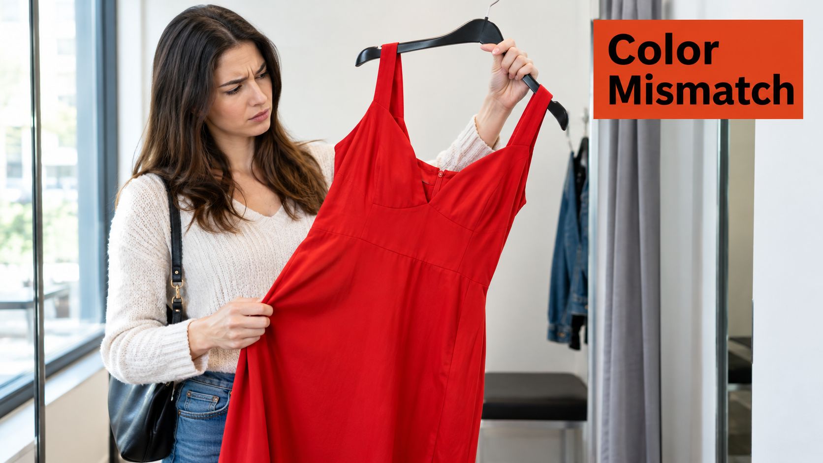
A customer orders a vivid red dress online because the virtual model shows a clean, saturated scarlet. When the dress arrives, the fabric looks darker and less lively. Lighting and material variation may explain part of the difference, but the digital asset can also be responsible. If the original garment color sits beyond what sRGB represents comfortably, the product page may have already flattened it before the shopper ever sees it.
Display P3 is a wider-gamut RGB color space designed for modern screens and color-managed digital content. It uses the same primary chromaticities as theatrical DCI-P3, but adapts them for general displays with a D65 white point and an sRGB-like transfer curve. That makes it more relevant to ecommerce photography, interfaces, and AI-generated fitting-room imagery than cinema's original projection-oriented specification.
From cinema screens to product pages
The Digital Cinema Initiative defined DCI-P3 in 2005 for theatrical digital motion-picture distribution, establishing a wider gamut than sRGB. The Society of Motion Picture and Television Engineers later documented a P3 variant in SMPTE EG 432-1:2010, using a D65 white point of approximately 6503.5 K, rather than the roughly 6300 K white point associated with theatrical DCI-P3. Apple then brought Display P3 to consumer computing with the late-2015 Retina iMac, which Apple identified as the first consumer-facing computer supporting the format. These milestones are summarized in the history of DCI-P3 and Display P3.
For merchants, the history is less important than the consequence. Wide-gamut color moved from specialist cinema and imaging workflows into devices used to browse fashion catalogs, preview cosmetics, and test virtual outfits.
Practical rule: Treat Display P3 as an asset-delivery option for capable screens, not as a replacement for every image in your catalog.
The issue connects directly to a familiar ecommerce problem, the gap between online confidence and physical reality. Product color is only one part of that gap, alongside size, cut, fabric behavior, and body presentation. Teams working on the wider problem of online shopping should treat color consistency as part of shopper trust, not as a finishing detail applied by design.
A P3 asset can preserve a richer red dress, vivid orange knitwear, or saturated green jacket. It won't make neutral cotton basics look dramatically different, and it can't correct poor photography, inaccurate garment samples, or an AI render that changes the fabric itself. Its value appears when the source color, display, profile, and delivery path all agree.
Understanding P3 vs sRGB Color Gamuts
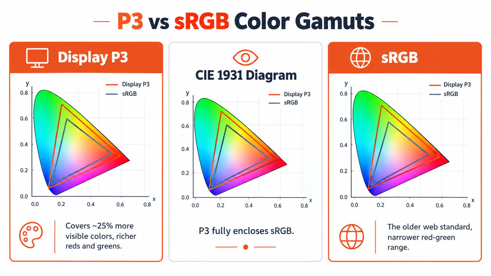
Display P3 and sRGB don't describe the same range of reproducible colors. On the CIE 1931 chromaticity diagram, Display P3 covers approximately 45.5%, while sRGB covers about 35.9%, according to the comparison from ColorFYI's Display P3 and sRGB analysis. That difference corresponds to roughly 25% more gamut area for Display P3.
Where the extra range helps
The additional gamut isn't distributed evenly across every hue. It matters most in highly saturated reds, oranges, and greens, which is why it can be useful for vivid fashion collections, sports kits, beauty products, and bright accessories. A muted beige sweater won't suddenly gain meaningful product information because its file is tagged Display P3.
The 25% figure describes gamut area, not 25% more visible detail in every image. A photograph may contain very little color beyond sRGB, or the shopper may use an sRGB display that can't show the expanded range. The display, operating system, application, color profile, and content pipeline all need to participate in color management before the additional colors can appear as intended.
That distinction prevents a common merchandising mistake. A team exports every product image as P3, sees richer colors on its calibrated design monitors, and assumes every shopper will see the same result. On an unmanaged device, the file may be clipped, interpreted as sRGB, or otherwise rendered inaccurately.
DCI-P3 isn't Display P3
The names are related, but they're not interchangeable. Display P3 keeps DCI-P3's primary chromaticities while using the D65 white point and an sRGB-like transfer curve. Cinema-oriented DCI-P3 uses different white-point and transfer characteristics intended for theatrical projection.
That difference affects virtual try-on because the garment color is part of a generated scene. If a saturated red jacket is rendered in a Display P3 workflow and then incorrectly converted, the shopper may see a different red on the product page. The model's pose can be accurate and the garment fit can be convincing, yet the image still creates doubt because the color feels wrong.
A disciplined color workflow also depends on editing decisions before delivery. Teams handling fashion photography can use this photography color grading guide as a practical reference for understanding how grading choices affect final output. The important ecommerce question is not whether P3 sounds more advanced. It's whether the product's meaningful colors need the extra range and whether the business can deliver it without sacrificing compatibility.
Practical Implementation for Product Imagery
The safest ecommerce implementation is a dual-asset strategy. Keep a Display P3 version for capable displays, and generate a carefully converted sRGB derivative for broad compatibility. This approach accepts reality of mixed devices instead of forcing every shopper through the same technical path.
Start with the source. Capture or create the master in a workflow that preserves the garment colors you care about. Keep the color profile attached during editing and export. Then produce the two delivery variants from the same controlled master, rather than recoloring a compressed web file after the fact.
Build the pipeline deliberately
Create a wide-gamut master. Preserve Display P3 information when the photography or AI render contains saturated colors that exceed sRGB. Check the garment against a physical sample or controlled reference before treating the file as approved.
Generate an sRGB fallback. Convert the master intentionally, then inspect the result. Don't let a browser, CDN, or social platform decide how out-of-gamut reds and greens should be mapped.
Retain metadata where supported. Embedded color profiles tell downstream software how to interpret RGB values. If an optimization process strips that metadata, a P3 image can be mistaken for sRGB and appear wrong.
Test the compressed output. Review the actual CDN-served file, not only the original export. Image resizing, format conversion, and compression can change the path between the AI render and the shopper's screen.
For large catalogs, batch processing can make the workflow repeatable, but automation still needs visual checks. A resource on batch color correction with MerchLoom can help teams think through consistent corrections across many product assets without turning every image into an isolated manual task.
Validate the complete journey
Android's official color-management documentation says wide color should be enabled only when the display meets hardware and characterization requirements, and systems must distinguish Display P3 from sRGB modes. It also highlights the importance of handling color information correctly across the system. See the Android wide-color documentation for the platform-level constraints.
Your acceptance test should include:
- A saturated red swatch, because red garments often reveal clipping or incorrect interpretation quickly.
- An orange or green garment, where P3's expanded range can offer a visible advantage.
- A skin-adjacent color, because a jacket or dress beside skin makes shifts easier to notice.
- A managed display and an unmanaged environment, including the browser and image format your shoppers use.
- The full AI-render path, from input asset to final fitting-room image, including CDN processing and mobile delivery.
If the P3 version looks excellent only in the design application, the implementation isn't ready. The fallback is not a lesser product. It's the control that keeps the catalog credible for shoppers who can't receive the wide-gamut version correctly.
Browser and Device Support Landscape
P3 support isn't a simple yes-or-no property. A device may have a wide-gamut panel, while the operating system, browser, application, image profile, or optimization layer still determines whether the shopper sees the intended color.
That creates two viewing environments. In a managed path, the system recognizes the profile and maps the image to the display correctly. In an unmanaged path, software may assume sRGB or ignore metadata, causing a P3-tagged image to look over-saturated, clipped, or unexpectedly dull.
Compare the delivery choices
| Delivery approach | Strength | Main risk |
|---|---|---|
| Display P3 only | Preserves vivid colors on capable screens | Can render inaccurately when profiles are mishandled |
| sRGB only | Broad compatibility and predictable fallback behavior | Compresses colors that extend beyond sRGB |
| P3 with sRGB fallback | Balances fidelity and reach | Requires asset management, testing, and correct selection logic |
Mobile-first retailers should be especially cautious. A shopper may open the product page in a browser, share the image through a social application, revisit it inside an in-app webview, and compare it with a screenshot. Each step can alter color handling.
The practical answer isn't to wait for a perfectly uniform ecosystem. Use audience evidence from your own analytics, identify the devices that matter commercially, and maintain the fallback until your delivery path proves reliable. A P3 workflow makes the most sense when vivid product colors are central to the assortment and modern wide-gamut screens represent a meaningful part of the shopping experience.
For catalogs dominated by black, white, gray, denim, and muted neutrals, sRGB may remain sufficient. The technical overhead of dual assets only pays off when the expanded range changes how shoppers judge the product.
Impact on Virtual Try-On and Conversion
Virtual try-on adds a second visual promise to the product page. The shopper isn't only asking, “Will this fit?” They're also asking, “Will this look like the item I receive?” A generated fitting-room image can answer the first question convincingly and still weaken confidence if the garment color shifts between the render and the device.

P3 has the strongest case where color carries merchandising weight. Vivid sportswear, bright swimwear, cosmetics, team jerseys, and fashion pieces with distinctive reds, oranges, greens, or cyans can benefit from a wider representation. Neutral basics and subdued fabrics usually offer less upside because their important visual information already fits comfortably within sRGB.
The commercial logic is straightforward. When the preview resembles the product more closely, shoppers have less reason to hesitate over color. That doesn't prove P3 alone will increase completed orders or reduce returns. It does create a more reliable visual foundation for testing those outcomes.
Measure confidence, not just brightness
A useful experiment should compare the same virtual try-on experience with controlled asset variants. Keep the garment, body model, layout, price, and copy consistent. Then segment results by device capability and image variant rather than treating every shopper as one audience.
Track qualitative and behavioral signals such as:
- Try-on completion, especially whether shoppers finish the render and continue browsing.
- Variant selection, including whether shoppers switch colors after viewing the render.
- Add-to-cart behavior, interpreted alongside device and product-color data.
- Color-related support contacts, returns, and review language.
- Asset delivery quality, including failed loads or fallback selection.
The image-generation pipeline also matters. A retailer can review this product visual creation workflow when mapping how source product imagery becomes a shopper-facing virtual preview. Color QA belongs inside that workflow, not after the fitting-room feature has already launched.
A realistic body render with an unreliable garment color still produces an unreliable product impression.
Color shouldn't be isolated from fit. Merchants evaluating height and weight body models should assess whether the same shopper-specific render preserves garment hue, surface detail, and silhouette across the supported delivery variants. A P3 file can't rescue a model that changes the garment's material, and accurate fit can't compensate for a dress that appears to change color on the way to checkout.
The right question is therefore not, “Does P3 convert better?” It's, “For which products and devices does better color fidelity improve confidence enough to justify the extra asset and QA work?” That answer belongs in segmented testing.
Best Practices and Decision Framework
P3 adoption works best as a merchandising decision supported by engineering, not as a blanket design upgrade. Start with the products. If vivid colors influence selection, differentiate variants, or define the brand's visual identity, wide gamut deserves a controlled test. If most of the catalog is neutral, an sRGB-first workflow may be more efficient.
Then examine the audience and infrastructure. A dual-asset setup is practical only when the team can preserve profiles, serve the correct derivative, monitor CDN transformations, and inspect the final image on real devices. If those controls aren't available, a well-managed sRGB file is safer than an unmanaged P3 asset.
Use a staged rollout
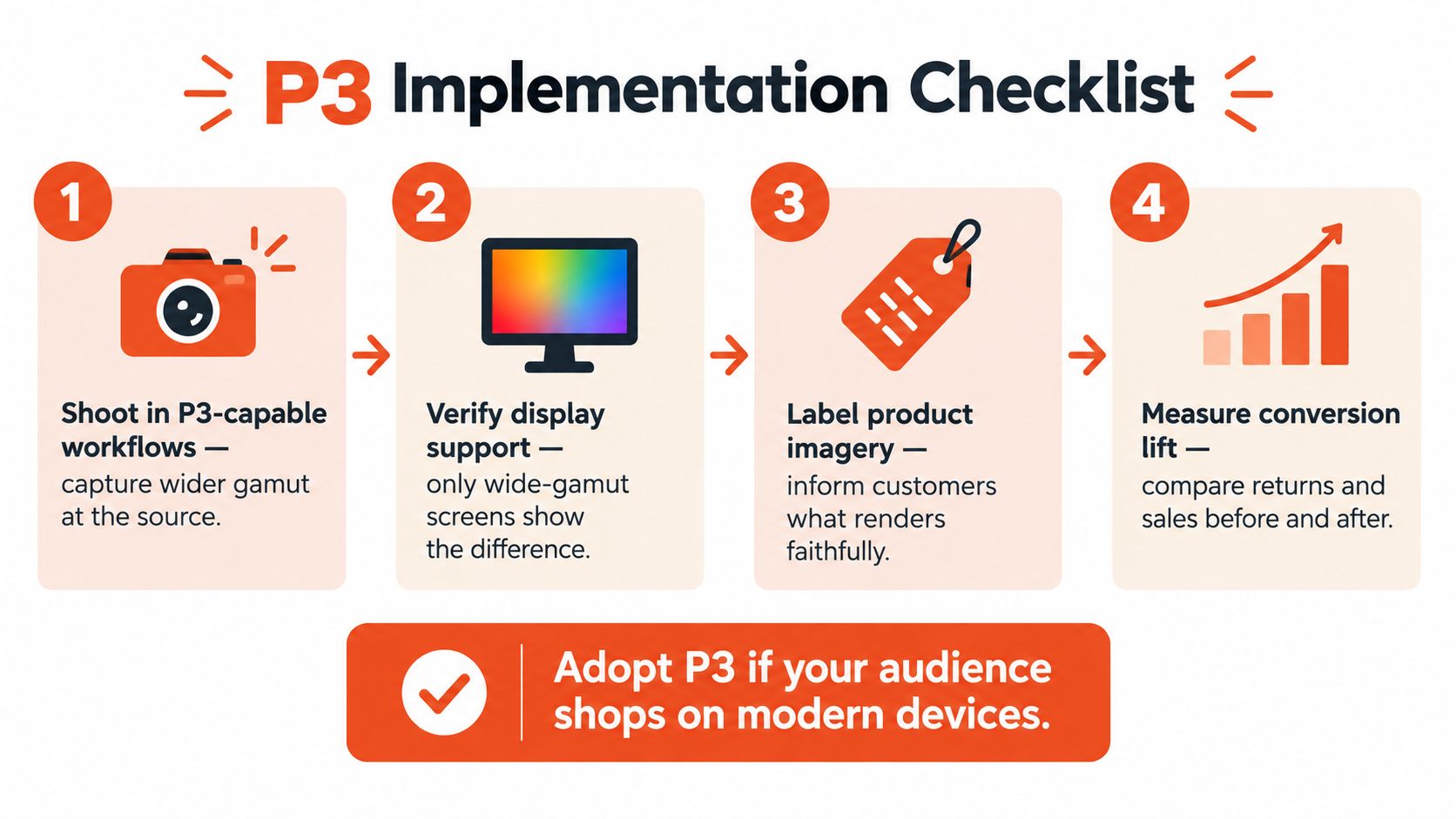
Select representative garments. Include a saturated red, a bright orange, a vivid green, a skin-adjacent shade, and a neutral basic. The set should expose both the opportunity and the limits.
Approve the source render. Compare the AI-generated fitting-room image with the product photography and physical reference. Confirm that the color is correct before creating delivery variants.
Create and label both assets. Preserve Display P3 for compatible paths and produce an sRGB fallback through an intentional conversion. Keep filenames, metadata, and catalog relationships clear.
Test real delivery conditions. Review the image through the production CDN, browser, mobile webview, and any social or merchandising surfaces that reuse the asset.
Measure by product and device. Compare shopper behavior, color-related feedback, and return reasons without attributing every change to the color space alone.
Keep the fallback permanent
The most damaging implementation is P3-only delivery with no reliable fallback. A shopper on an older or unmanaged device may see an image that looks less accurate than the original sRGB version, and color trust is difficult to rebuild once the product feels deceptive.
Use a simple decision matrix:
| Catalog or capability | Recommended approach |
|---|---|
| Vivid garments and modern audience devices | Test Display P3 plus sRGB fallback |
| Mixed devices and uncertain metadata handling | Make sRGB the safe default, add P3 selectively |
| Mostly neutral product range | Prioritize accurate sRGB delivery |
| Strong image pipeline and rigorous QA | Expand P3 by color category and device segment |
| Uncontrolled third-party image reuse | Deliver the most compatible approved derivative |
For Shopify teams evaluating the broader merchandising stack, the best Shopify clothing apps can help frame virtual try-on alongside sizing, product discovery, and catalog operations. The color decision should remain specific: adopt P3 where it improves garment representation, retain sRGB where compatibility matters more, and validate the shopper's final view rather than trusting the export alone.
Robosize combines a shopper-specific body model, photorealistic virtual try-on, and garment-level size recommendations in an on-page fitting-room experience. If you want to test whether better fit visualization and color-managed product imagery can strengthen confidence across your catalog, visit Robosize and explore the implementation options for your store.